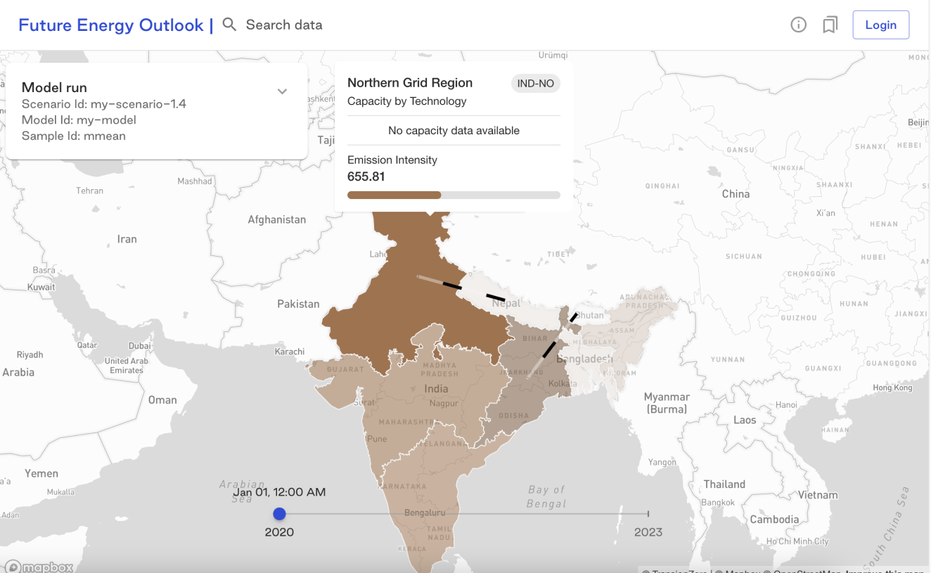
Preview of demo product that needs improvement
Background
The startup Transition Zero is an NGO that focuses on minimising climate impact. Their mission involves offering and evaluating data on fixed-point emitters across the world.
The focus for this project was to provide a improved user experience for their web-based flagship product ‘Future Energy Outlook’. The product assists users in addressing challenging inquiries related to the energy transition worldwide. This encompasses considerations of trade-offs involving land use, climate mitigation, and other policy objectives. All of this is accomplished within a online framework that is fully shareable and reproducible.
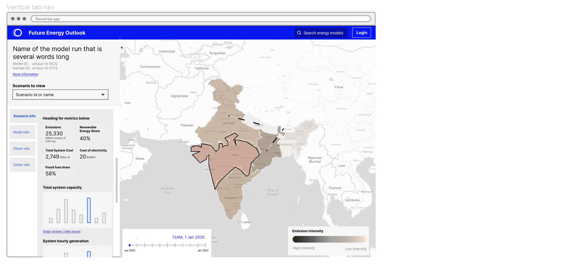
There was an initial product for demo purpose however it lacked a user friendly interface and an inclusive design approach. Research conducted by my team suggested that users were having a difficult time understanding what was presented within the demo product.
Goals
The product itself strives to present its data and model in a transparent and user-friendly manner, enabling users to independently access information and draw their own insights. Previously, the company had to manually compile these insights as per request.
Based on what I was briefed on, my goals were on the following areas:
Improving overall UI/UX design
The current demo interface needs to be re-designed to make it user friendly and aesthetically cohesive through the use of MUI kit.
Visual accessibility
In one of our earliest interviews, a participant mentioned they were colourblind and so could not distinguish between shades of colour visualised on the map for representing emission data.
Team
The project involved working in a collaborative manner with the delivery manager, senior interaction designer, researcher and front-end developers. My role in the team was as an interaction designer.
From a design standpoint, I collaborated with another designer to create a user-friendly interface for accessing data within a web product.
Some of my core responsibilities were:
- Supporting the development of a standardised UI
- Initial layout designs for the web interface
- Better map visualisation with accessibility considerations
Target users
We’ve conducted initial research to identify potential users for the open-source product, and while there are many more user groups, we’ve highlighted some of the key ones below:
- Researchers
- Academics
- Data scientists
- Journalists
- Government departments
- Those working in the private sector
Process
De-constructing the existing demo product
I conducted a thorough analysis of the interface, focusing on its functionality and how it responded to user interactions. I annotated the existing product, broke down its components and their groupings on the interface, allowing me to uncover important relationships, such as how adjusting the timeline affected the data matrix in the sidebar or how clicking on a region within a map impacted the data.

Competitor analysis
I collaborated with a team member to research comparable products in the market, which was pivotal in gaining insights into the market landscape. This comprehensive analysis offered a clear perspective on the competitive dynamics within the energy industry, allowing us to identify competitors, their offerings, and their market positioning.
Grouping of components breakdown
I delved into component groups within the interface as part of my exploration of the demo product. I dissected the core functionalities, including the timeline, sidebar, and map interaction, breaking them down into smaller constituent elements. This process not only revealed the finer details that constituted these larger components but also allowed me to pinpoint areas where improvements could enhance the user experience.
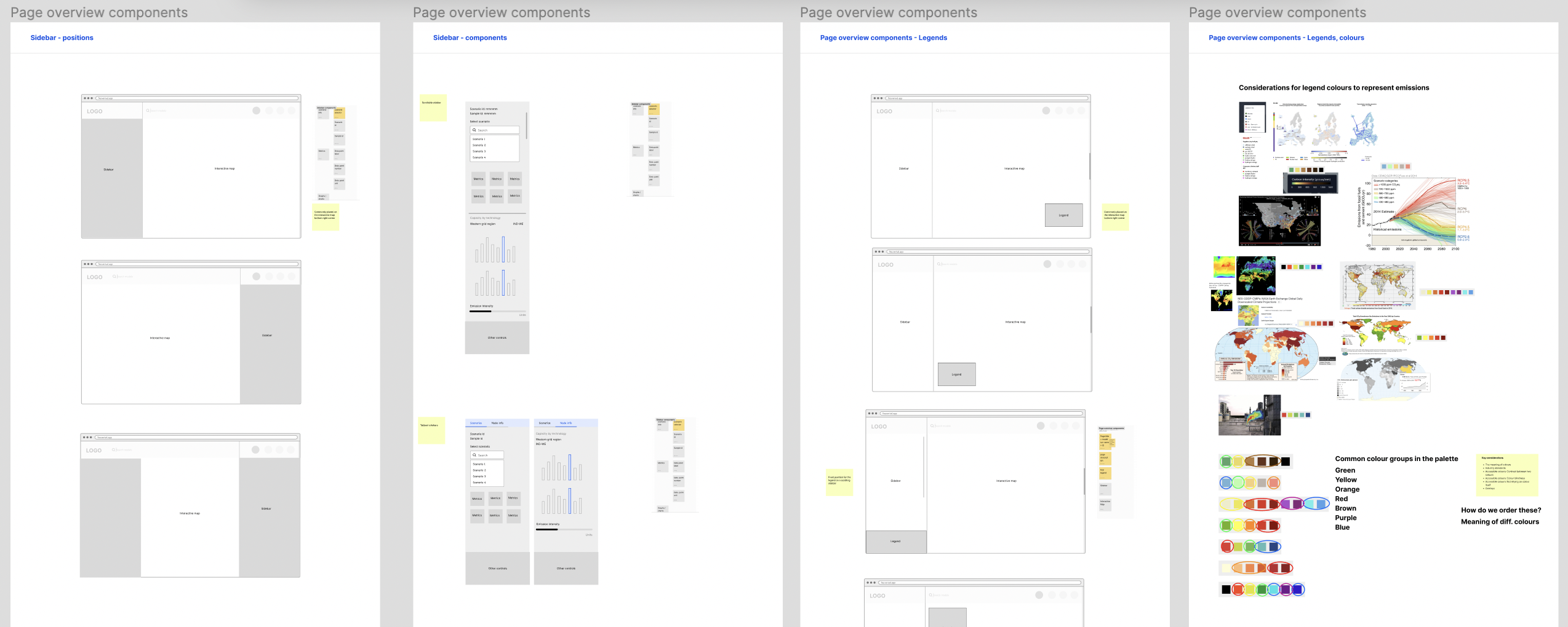
For instance, when examining the ‘page overview’ group, I noted the absence of a page title to provide context, a page description to explain the content, and a legend to clarify the meaning of map colours. These were features present in competitor products, highlighting potential enhancements.

Wireframing
I began with basic, low-fidelity wireframes, refining them as I gained a deeper understanding of the project requirements. Throughout the process, I maintained continuous feedback loops with clients and incorporated insights from user research, leading to iterative improvements in the design.
Stage 1 – Low-fi layout options
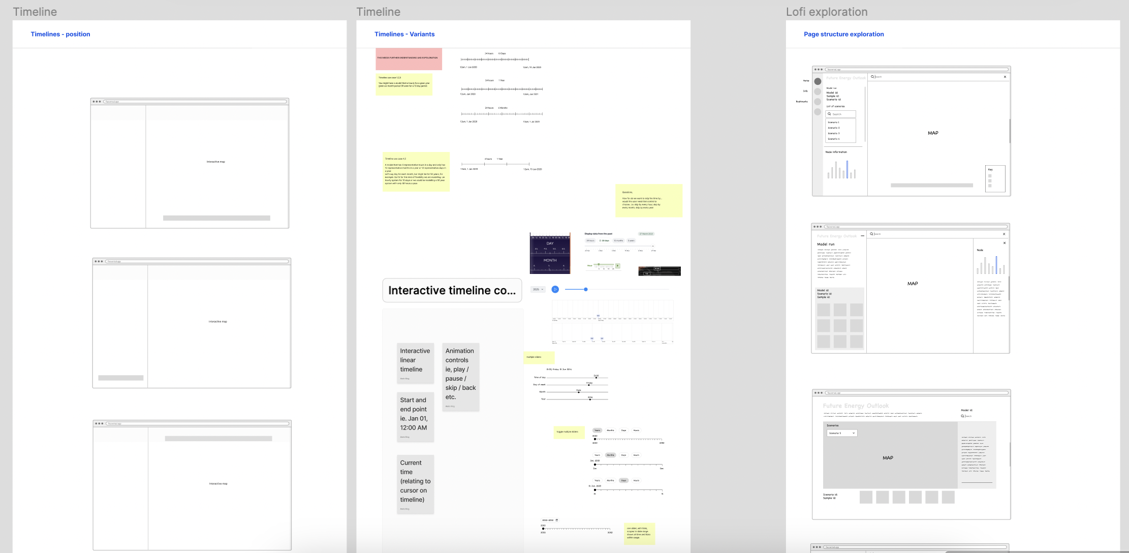
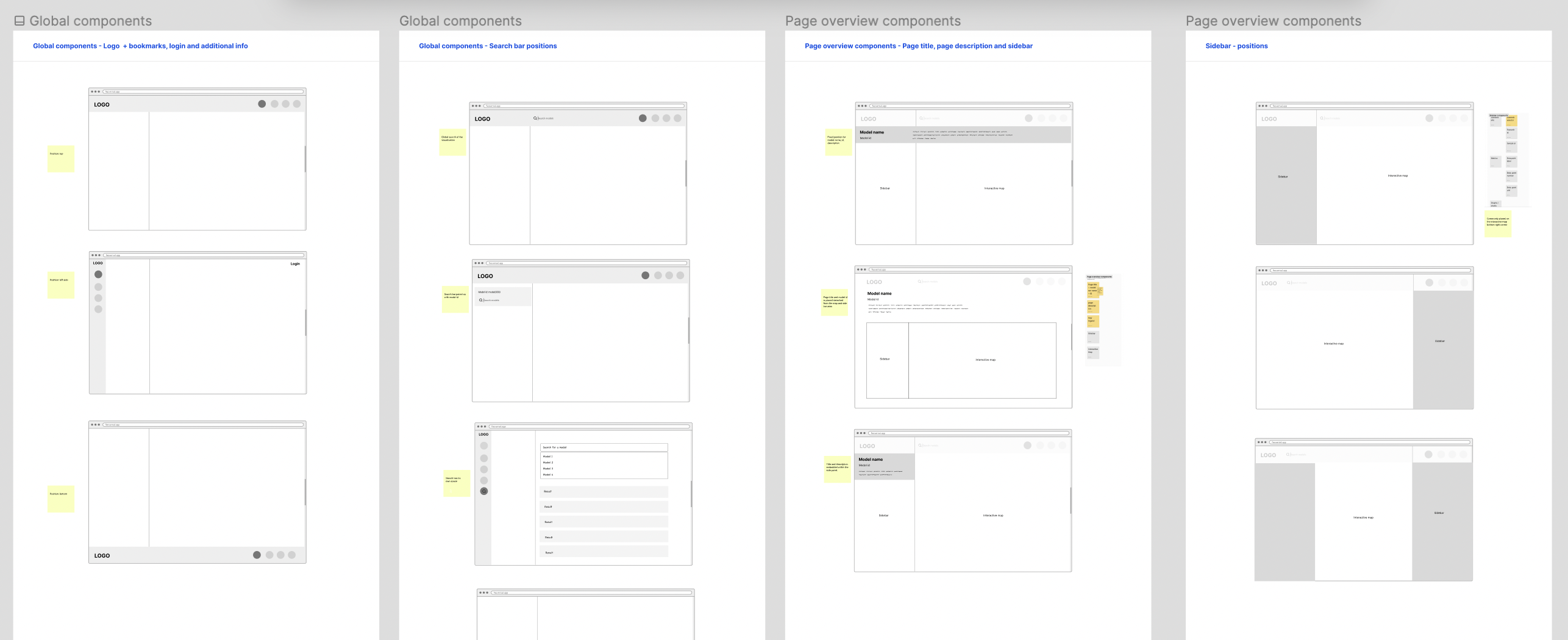
I developed low-fidelity wireframes to explore various layout possibilities for each of the previously identified component groups, encompassing global elements like the top navigation bar, page overview components, sidebar arrangements and elements, legends, map color schemes, and the timeline.
Stage 2 – Developing stronger concepts
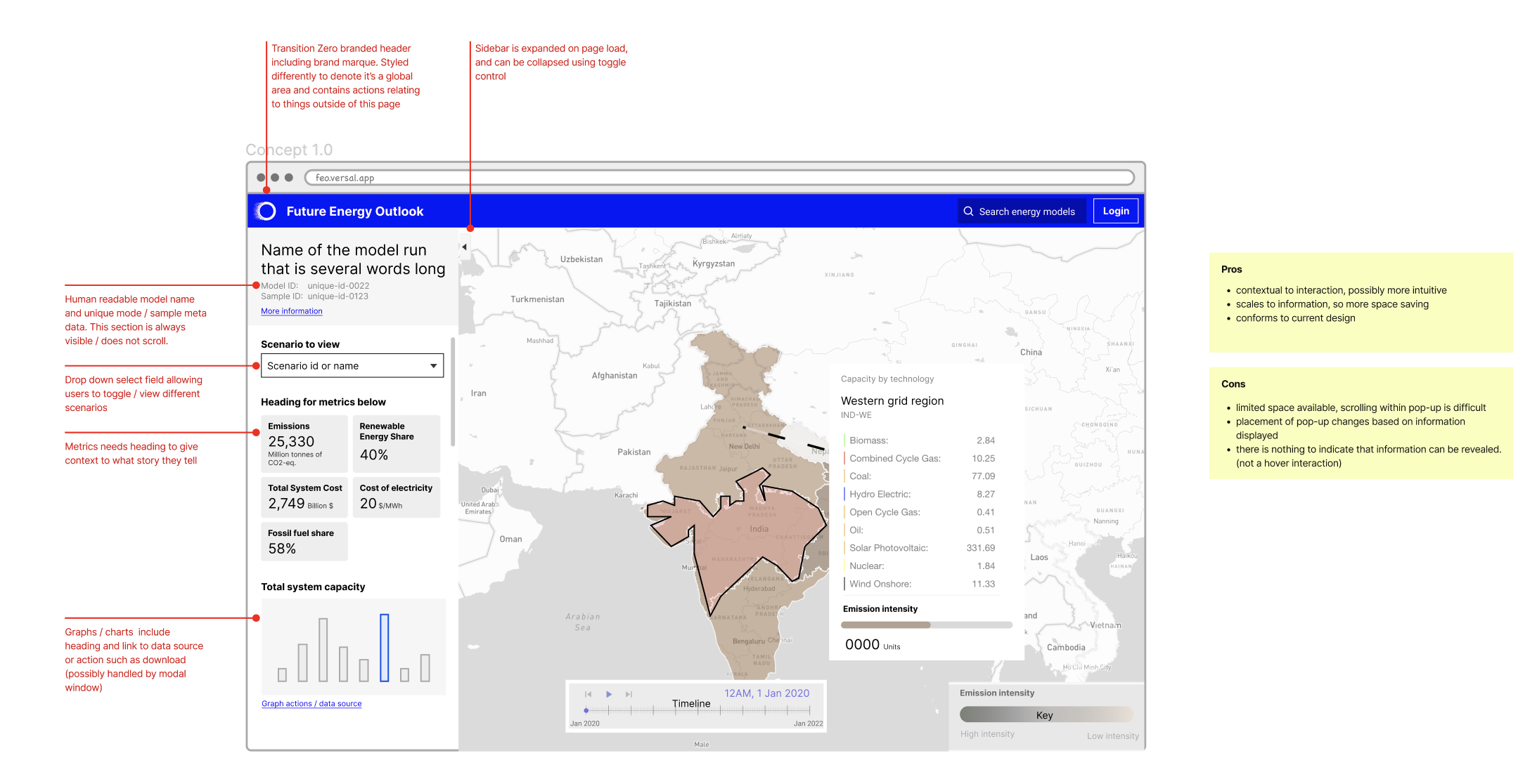
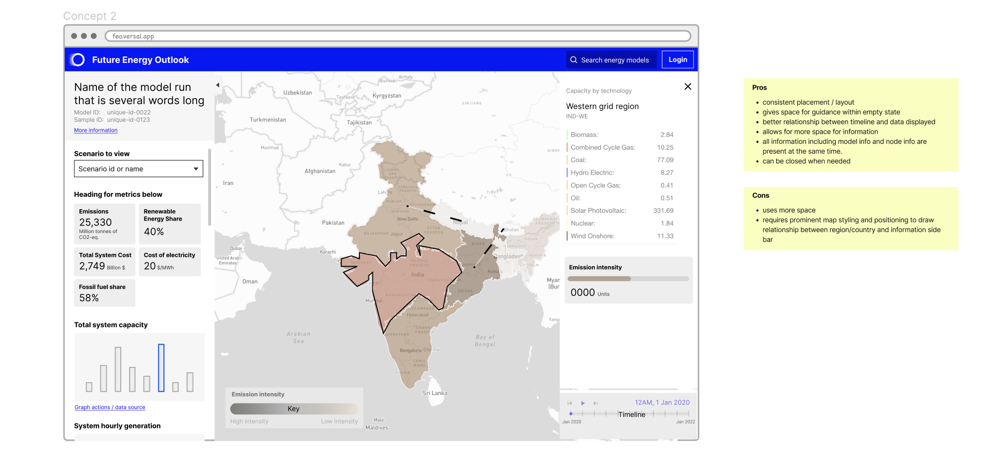
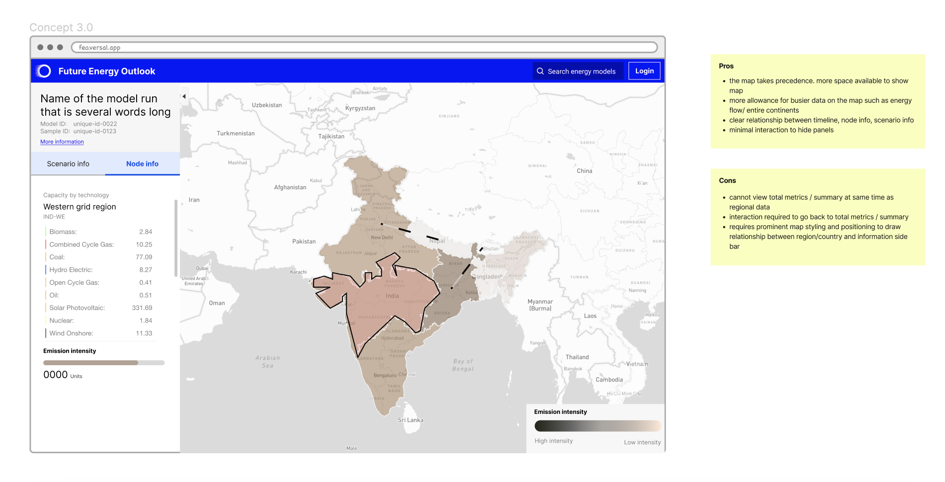
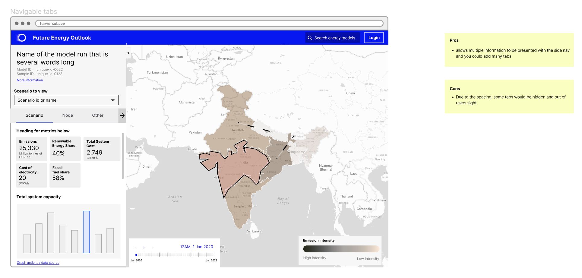
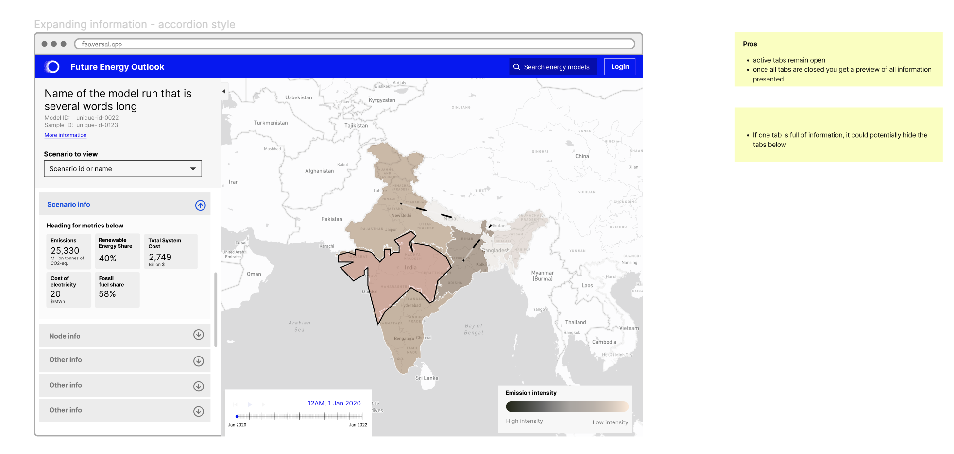
I transformed the initial low-fidelity wireframes into three robust mid-fidelity design concepts, offering a more detailed representation. This allowed for a comprehensive assessment of the pros and cons of each design, initiating discussions with the client to make informed decisions about which concept to further develop. Evaluating these aspects guided the decision-making process on whether to proceed with a design concept as is, refine it, or explore alternative approaches to align with the project’s objectives and overarching vision.
Stage 3 – Concept 3 further explored
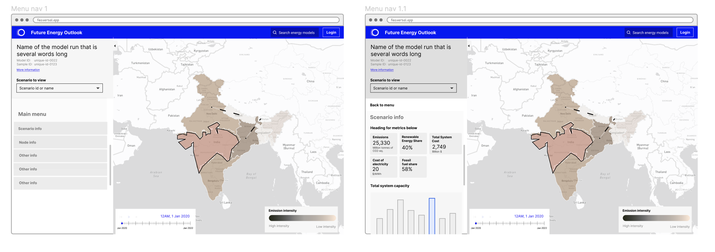
Following client feedback and industry best practices, we chose to expand upon concept 3, which offered the advantage of presenting multiple pieces of information in a single sidebar while conserving screen space. This decision led to the development of four distinct design variations within concept 3.
Design development
Area of focus for this case study:
Due to the size of project, It’s not possible to talk about every aspect of the process, although, I do want to talk about two areas which contributed a larger part in this case study.
- Sidebar
- Map design
1. Sidebar
I took one design from the wireframe and created a high-fidelity design from it using the MUI kit that the client wanted and had previously built on.
I wanted to focus on these key points which were identified initially during the product breakdown:
- How can we design the sidebar, so that it’s purpose is more obvious? ie, is it
relating to the entire map, or the tool tip? - How can the sidebar be opened / closed to give more room to the map?
- How do we explain abbreviations? Ie. “RE share” / “CO2 EQ” – do we use
tooltips? - How do we best present hierarchy / size of text and relationship with units
Sidebar width
The sidebar’s width is a critical aspect of the design, and the decision-making process was influenced by several factors. Best practice suggests that the sidebar should typically occupy between 20-40% of the overall screen width, which translates to approximately 3.2 columns in an 8-column grid.
Considering a relatively small desktop screen width of 1280px, I evaluated the feasibility of the sidebar occupying 1/3 (33.3%) of the total screen width versus 1/4 (25%). It became apparent that 1/3 of the screen width was more suitable for accommodating essential content, including summary metrics, expanding areas, graphs, and charts, whereas 1/4 of the screen width appeared insufficient.
To ensure a consistent user experience, a fixed width of 420px was selected for desktop screens, as it would remain constant and adequately display both the map and sidebar, regardless of the user’s screen size.
Sidebar experimentation

UI design of the sidebar
These high-fidelity sidebar designs have evolved through careful consideration and the utilisation of the UI kit. The displayed screens showcase different states of the sidebar, highlighting its versatility as a multi-purpose tool within the interface.


Re-designing chloropleth map and interactions
With the sidebar design finalised, my focus has now turned towards enhancing the map. Our team’s research has shown that the map visualisation poses accessibility challenges for colour-blind users. One specific user struggled to differentiate between the various regions on the map as the colours appeared very similar, making it difficult to discern the borders.
Choropleth maps are a type of thematic map that represents data using different shades or colours in predefined geographic areas, such as regions, countries, or districts. The variations in colour or shading on the map are used to visualise and convey information about a specific attribute or variable within those geographic areas.
The factors to consider were:
- Industry standards around the meaning of colours
- Using accessible colours: colours that are next to each other have enough contrast
- Interaction on clicking specific regions on map
- Closeness to the brand palette
- Overall aesthetic and how well it works with the base map
- Accessibility
- Making sure the colours have enough contrast when they are placed next to each other.
- Considerations around people with colour blindness. This looks like the three common types. Deuteranopia, Protanopia, Tritanopia and Monochromacy (where users may not be able to see any colour and any colour will display in greyscale
Understanding industry standards for carbon emissions.
The next logical step was to determine the common colours used to represent carbon emissions on maps. This analysis revealed that there are numerous colour palettes employed to depict the intensity of carbon emissions, although the patterns typically adhere to either a single hue or multi-hue palette.
While exploring, it was evident that subtle differences in hue, saturation and brightness can impact the overall feel of the map. This was important as we didn’t want to go too far from the Transition Zero feel.
Addressing colours for colour blindness
When developing colour palettes, it was crucial to assess how these colours might appear to individuals with colour blindness, a pivotal factor in making appropriate colour choices. Additional considerations involved fine-tuning the hue, saturation, and brightness of the colours to ensure sufficient contrast between them. One of the most important forms of colour blindness to consider was monochromacy, where the individual doesn’t see any colour at all.
Don’t use color alone to convey information
It’s important to note that using colour alone in visualisation may sometimes not be sufficient to convey various data overlaid on a map. This can be especially useful for someone with colour blindness, for example. This was a consideration while exploring the map. In general, combining a colour with a pattern can improve legibility.

I initiated an exploration into maps that included pattern overlays. However, it became evident that such patterns introduced extra complexity and visual clutter, particularly when attempting to represent a substantial amount of data. Additionally, I received advice from Snook’s accessibility specialist, who recommended that, in this specific context, a well-differentiated colour palette alone should be sufficient on the map, negating the need for pattern overlays.
Making the base map simpler
I refer to the data display as the ‘base map,’ and it was created using Mapbox’s map visualizer with the data overlaid. We conducted multiple explorations to find the most suitable base map.
During these explorations, we identified what worked well for the overall visual style, determined which base colours to steer clear of, and pinpointed the base colours worth keeping. However, selecting a single base map colour remains a challenge due to the distinct advantages and disadvantages of each option.
Other settings within the Map box were considered to improve the overall map.
- Removing unnecessary details within the map including removing states within countries, provinces and roads etc. can help give more prominence to the overlayed map data.
- Keeping the base map label colour muted will also help in giving more attention to what is overlayed on the map but it is good to make sure its still readable enough to find out which part of the world users are looking at.
- Customising the fonts to suit the typography within Transition Zero is also considered. The difference in font weights and sizes is a good way to let the user know about the layering of labels i.e. continent vs countries. San serifs are recommended to be used on the map for better readability


Presenting back options on maps
When it came to presenting the choropleth maps, I had crafted designs with accessibility in mind and sought to validate their alignment with the client’s preferences. I presented a selection of core designs, assessing their respective merits and drawbacks in line with the initial criteria. This approach yielded deeper insights into what was working effectively and what required refinement. Ultimately, the client expressed a preference for the light basemap option featuring multiple red/brown tone hues.
Continuing exploration – legends
As a best practice for enhancing data visualisation, it is essential to include a key or legend so that users can easily reference where a particular data point falls along the scale.
Improving map interactions
As the user interacts with the map data(hover or select), the map will need to behave in a certain way that tells users they can do something with it. There may be a slight change in visuals such as the variation of node colours, and boundary lines to emphasise what users interacted with.
In this case, you’d consider the default state of the map nodes before interaction, the state as you hover, and the state when a node is selected.
The process of deciding map interactions includes considerations of boundary lines, changes in colour/texture and any overlays.
To visualise, below is a base map with emission data on.
Handover to developers
After each hi-fi design had been created, I would create a handover document on Figma detailing all the details of the design and interactions. The development was to be done incrementally and new releases appeared as the work continued.


