


Transforming a Housing Customer Portal into a Self-Service Experience
Increasing digital adoption and reducing customer support demand through human-centred design
01. Overview
1.1 Project Snapshot
My Role
Lead UX/UI Designer
I joined the project after the initial discovery research had been completed.
My role was to transform research insights into an end-to-end product experience by leading the design process from ideation through delivery.
I worked closely with Product Managers, UX Researchers, Business Analysts and Engineers to align customer needs with business objectives and technical feasibility.
Skills Demonstrated
- UX Strategy
- Design Thinking
- Workshop Facilitation
- Journey Mapping
- Information Architecture
- Interaction Design
- Visual Design
- Accessibility
- Prototyping
- Developer Collaboration
- Stakeholder Management
- Product Thinking
Team
- Supporting UX Designer
- UX Researcher
- Business Analyst
- Subject Matter Experts
- Copywriter
- Front-End Developers
- Back-End Developers
- Engineering
- Stakeholders
Responsibilities
- Design Thinking facilitation
- Workshop facilitation
- Opportunity mapping
- How Might We workshops
- Information Architecture
- Customer journey mapping
- UX Design
- UI Design
- Interactive prototyping
- Accessibility
- Usability testing
- Developer handover
- Design QA
- Early Life Support (ELS)
Duration
1 year (Jul 2024 – Jul 2025)
1.2 The Challenge
A UK housing provider wanted to increase digital adoption by improving its customer self-service portal.
Although residents could already report repairs, make payments and manage their tenancy online, the experience had become difficult to use. Navigation was confusing, key journeys were fragmented and customers often lacked confidence that their requests had been completed successfully.
As a result, many residents preferred contacting customer support for tasks that should have taken only a few minutes online.
The redesign aimed to create an intuitive, accessible and mobile-first experience that encouraged customers to self-serve while reducing operational demand.
1.3 Benefits Metrics
02. Understanding the Problem
2.1 The Challenge
Although the portal already existed, research showed that customers simply weren’t choosing to use it. Instead, they contacted customer support to complete tasks such as reporting repairs or checking account information.
The challenge wasn’t a lack of functionality. The challenge was creating enough confidence, clarity and simplicity for customers to complete journeys independently.
When I joined the project, the UX Research team had already completed customer interviews, surveys and analytics analysis.
Rather than repeating discovery, my focus became understanding:
How do we transform research into a product people genuinely want to use?
2.2 What We Learned
Initial research highlighted several recurring themes.
Customers struggled to:
- register for an account
- locate important services
- report repairs efficiently
- understand repair progress
- complete tasks on mobile devices
- trust that requests had been submitted successfully
Each issue represented an opportunity to redesign the experience around customer behaviour instead of organisational processes.
The previous experience
2.3 From Research to Strategy
Rather than moving directly into interface design, I facilitated collaborative Design Thinking workshops that brought together Product, Engineering, Customer Services and Business stakeholders.
These workshops helped create a shared understanding of customer problems before discussing solutions.
Instead of asking:
“What should we build?”
we first asked:
“What problem are we trying to solve?”
This shift helped move conversations away from features and towards customer outcomes.
2.3.1 Defining Opportunities
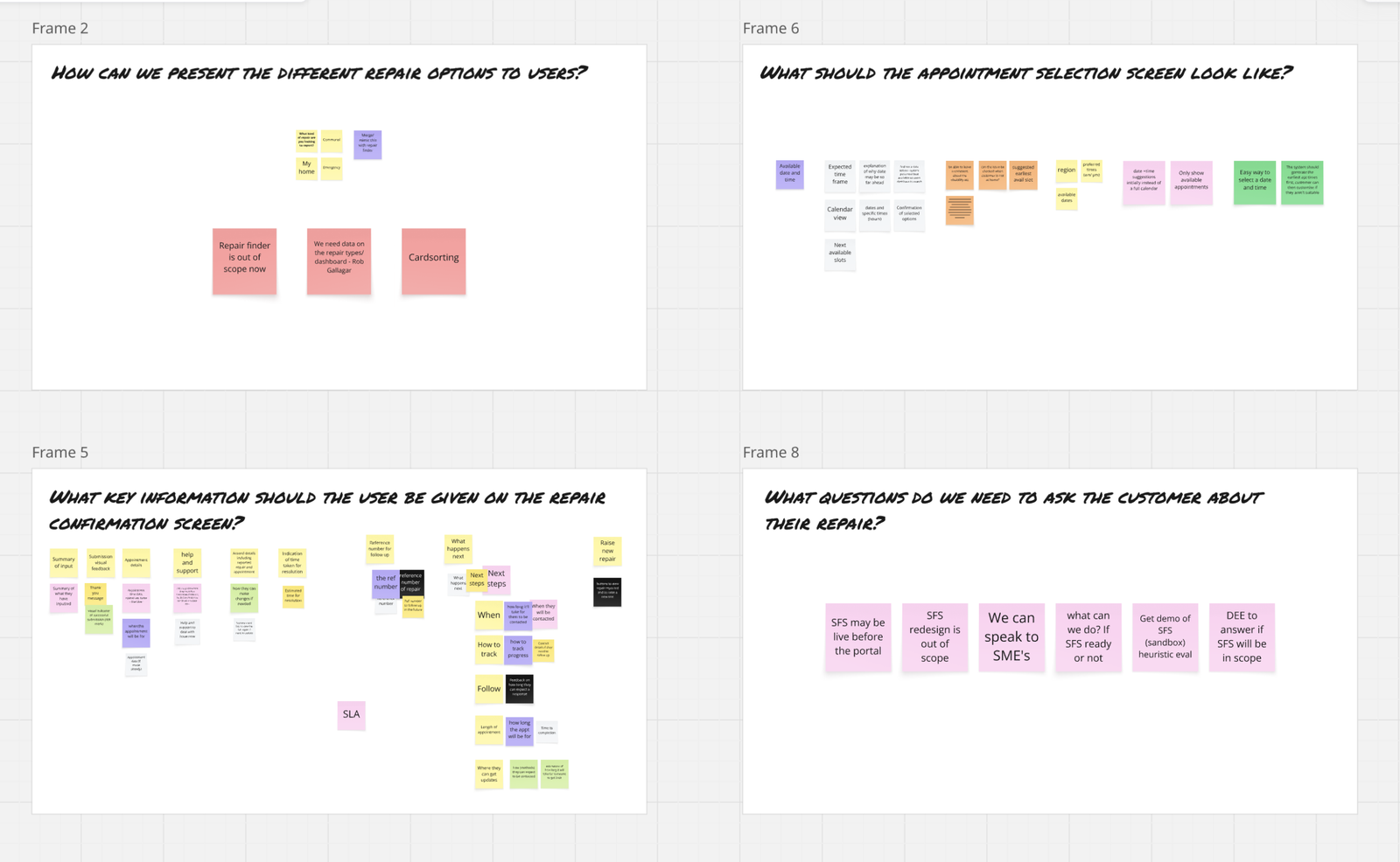
Using insights gathered during discovery, I facilitated How Might We exercises to reframe problems into opportunities.
Examples included:
How might we simplify account registration?
How might we make reporting repairs effortless?
How might we reduce unnecessary calls to customer support?
How might we increase customer confidence after submitting a repair?
These questions became the design principles that guided the rest of the project.
2.3.2 Designing Around Customer Needs
Customer feedback revealed recurring frustrations across multiple journeys.
Rather than treating each issue independently, I grouped them into broader opportunity areas that informed the product roadmap.
Simplifying Payments
Customers wanted quicker access to rent information, clearer payment summaries and a more straightforward payment journey.
Design improvements focused on surfacing outstanding balances, reducing navigation and improving the mobile payment experience.
Making Repairs Easier
Reporting repairs was one of the portal’s most frequently used services, yet customers found the process confusing.
We simplified reporting, improved repair tracking, supported photo uploads and reduced unnecessary navigation.
Improving Navigation
Customers often struggled to locate services after signing in.
The information architecture was redesigned around customer tasks rather than internal organisational structures, reducing the effort required to complete common journeys.
Increasing Confidence
Customers wanted reassurance that actions had been completed successfully.
The redesigned portal introduced clearer confirmations, status updates and notifications throughout key journeys.
Mobile First
Given that most portal sessions occurred on mobile devices, layouts, navigation and interactions were redesigned specifically for smaller screens rather than adapting desktop experiences.
03. Designing the Experience
With priorities agreed, I began designing the end-to-end experience across the portal.
3.2 Design & Research Tools




3.3 Output
Overall, I managed to implement…
3.4 From Ideation to Implementation
3.4.1 Lo-Fi Sketches
Exploring ideas quickly before investing in design
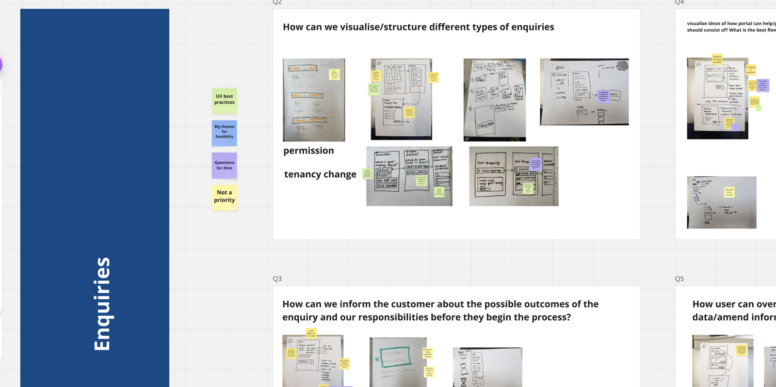
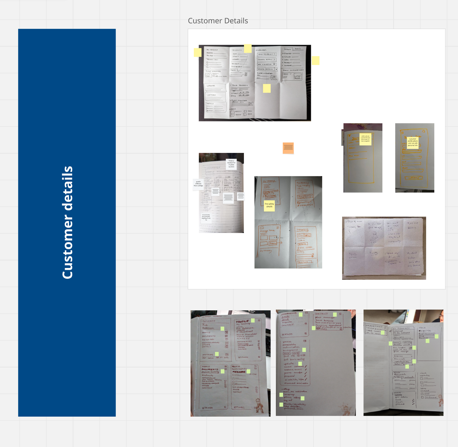
The initial concepts were created using rapid sketching and Crazy 8’s exercises during collaborative ideation workshops. This allowed the team to explore multiple approaches to solving the same problem without becoming attached to a single solution too early.
Pairing sketches with the How Might We questions ensured ideas remained grounded in customer needs identified during research rather than assumptions or stakeholder preferences.
3.4.2 Lo-fi Wireframes
Defining structure before visual design
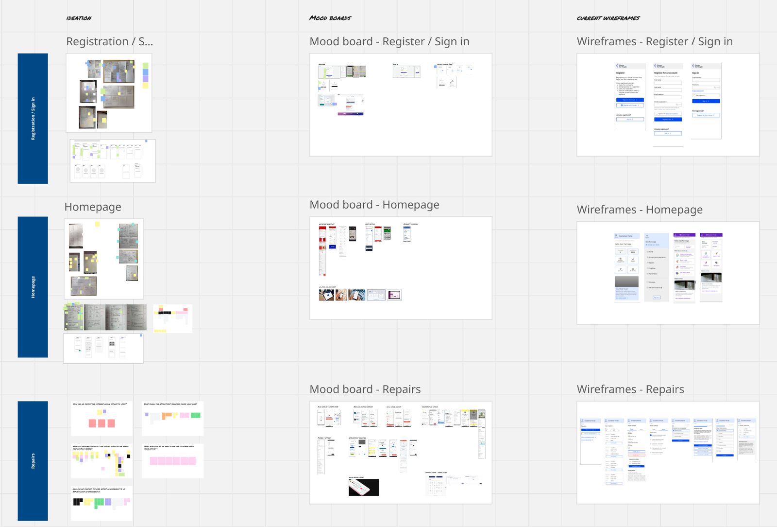
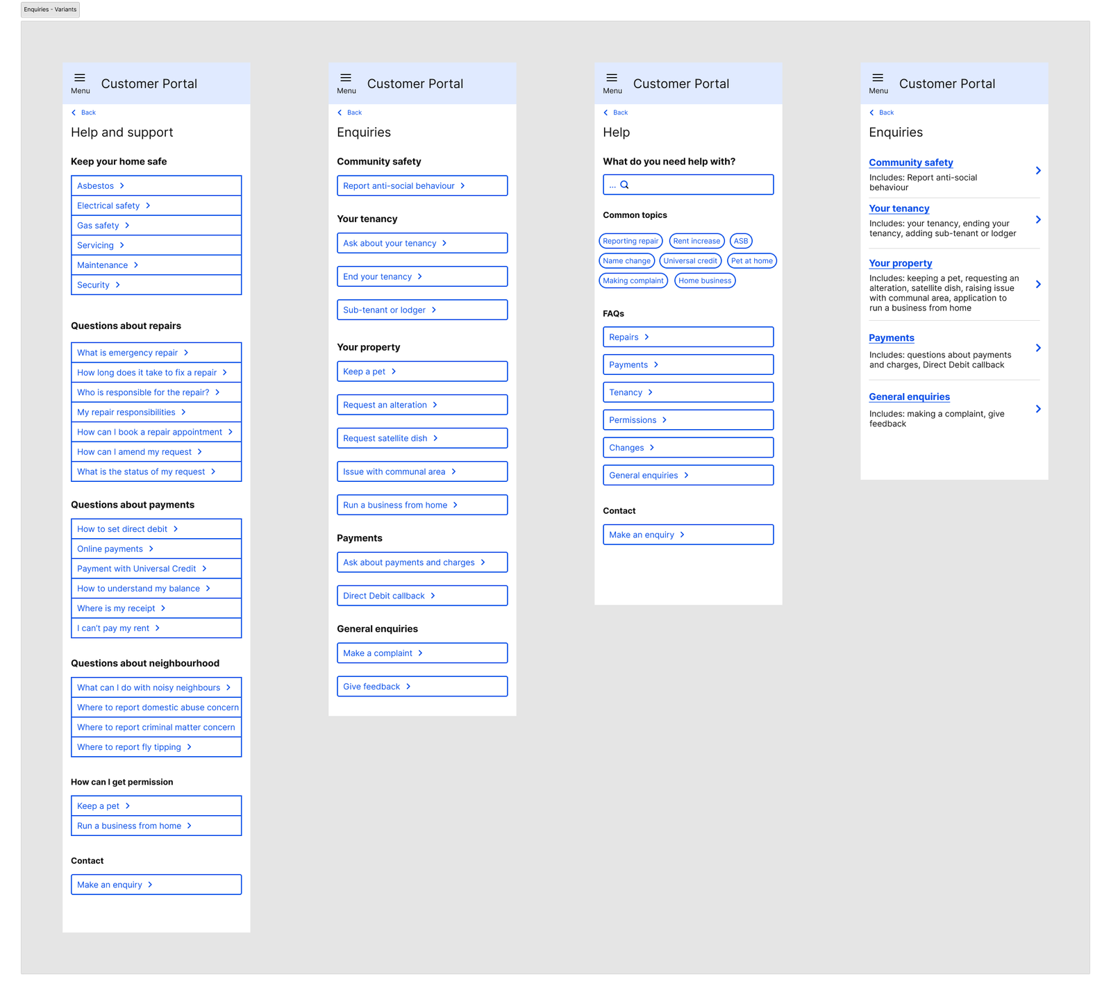
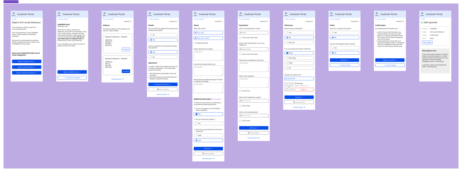
Once the strongest concepts had emerged, I translated them into low-fidelity wireframes to validate navigation, information hierarchy and user journeys.
Working in low fidelity encouraged faster iteration, making it easier to refine layouts and interactions before investing time in visual design.
This stage focused on answering:
- Can users complete key tasks?
- Does the navigation make sense?
- Is the content hierarchy clear?
rather than visual styling.
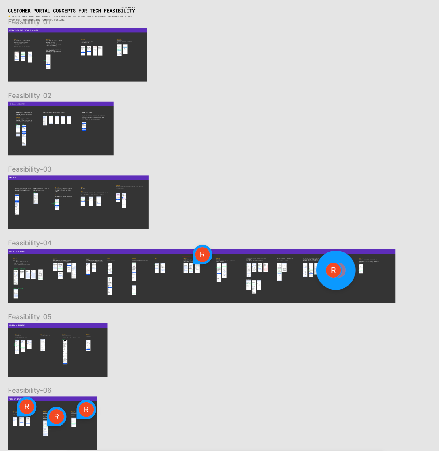
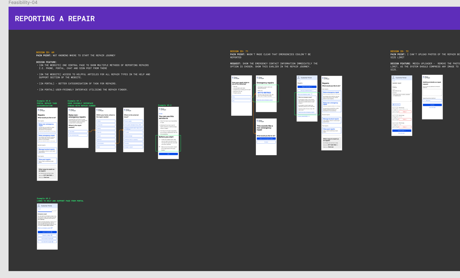
Tech Feasibility
Designing collaboratively with engineering
Rather than treating technical feasibility as a final development consideration, I worked closely with engineers throughout the design process to understand platform constraints and identify opportunities.
Early technical discussions helped validate interactions, reduce implementation risk and ensure proposed solutions could be delivered within the MVP.
Balancing customer needs with technical feasibility allowed us to make informed design decisions without compromising the overall experience.
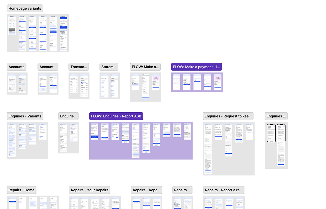
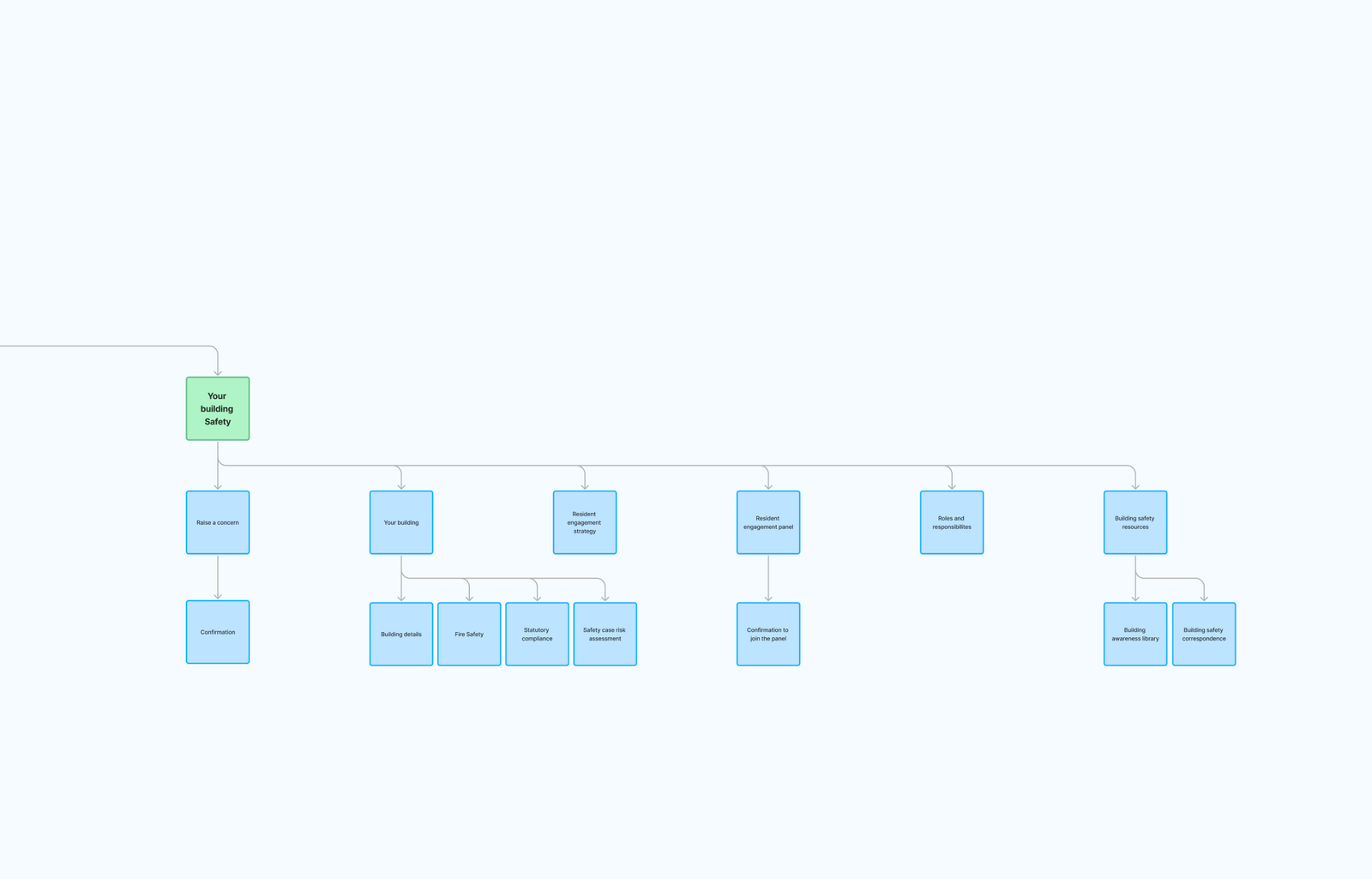
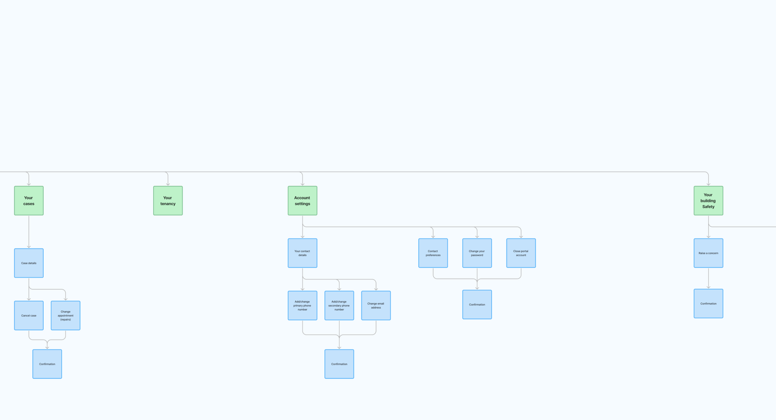
Information Architecture
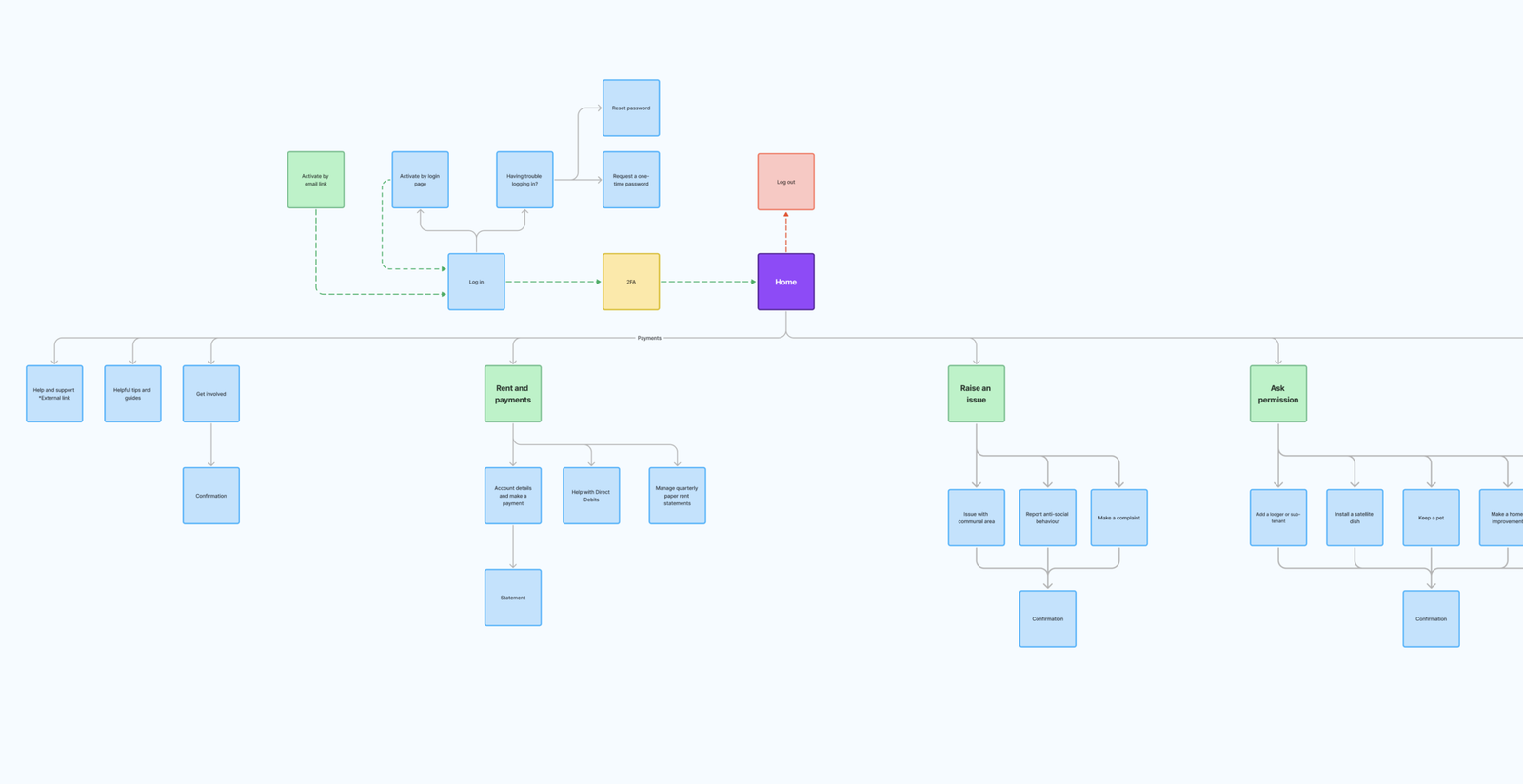
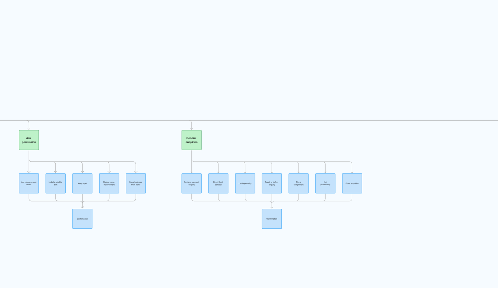
Organising the portal around customer goals
The existing portal reflected internal organisational structures rather than the way customers naturally thought about their tasks.
Working with stakeholders, I restructured the information architecture to better align navigation with customer goals, making important services easier to discover while reducing unnecessary navigation.
This provided the foundation for all subsequent user journeys.
As-is & To-be User Flows
Understanding today’s experience before designing tomorrow’s
Mapping existing customer journeys helped identify unnecessary steps, duplicated interactions and opportunities to simplify the experience.
By comparing current and future state flows, the team could clearly understand where friction was removed and how proposed improvements supported both customer outcomes and business objectives.
These artefacts also became valuable communication tools throughout development.
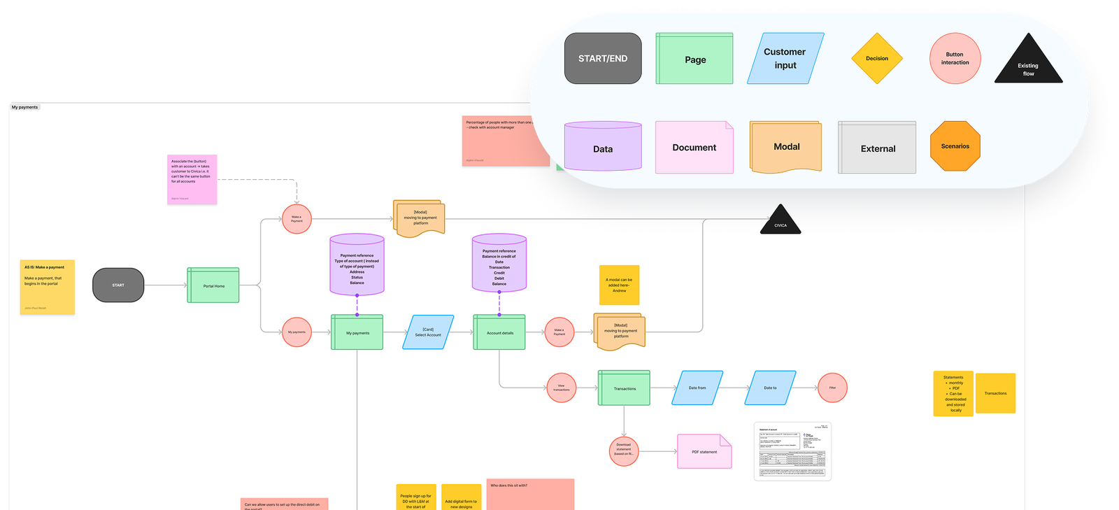
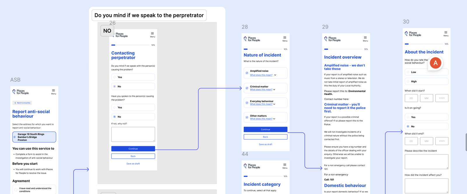
Mid-Fidelity Flows
Refining interactions through iteration
As concepts matured, user flows evolved into more detailed interaction models.
These mid-fidelity designs allowed the team to validate navigation, content hierarchy and decision points while remaining flexible enough to iterate quickly based on stakeholder feedback and usability testing.
Working at this fidelity helped bridge the gap between conceptual wireframes and production-ready interface design.
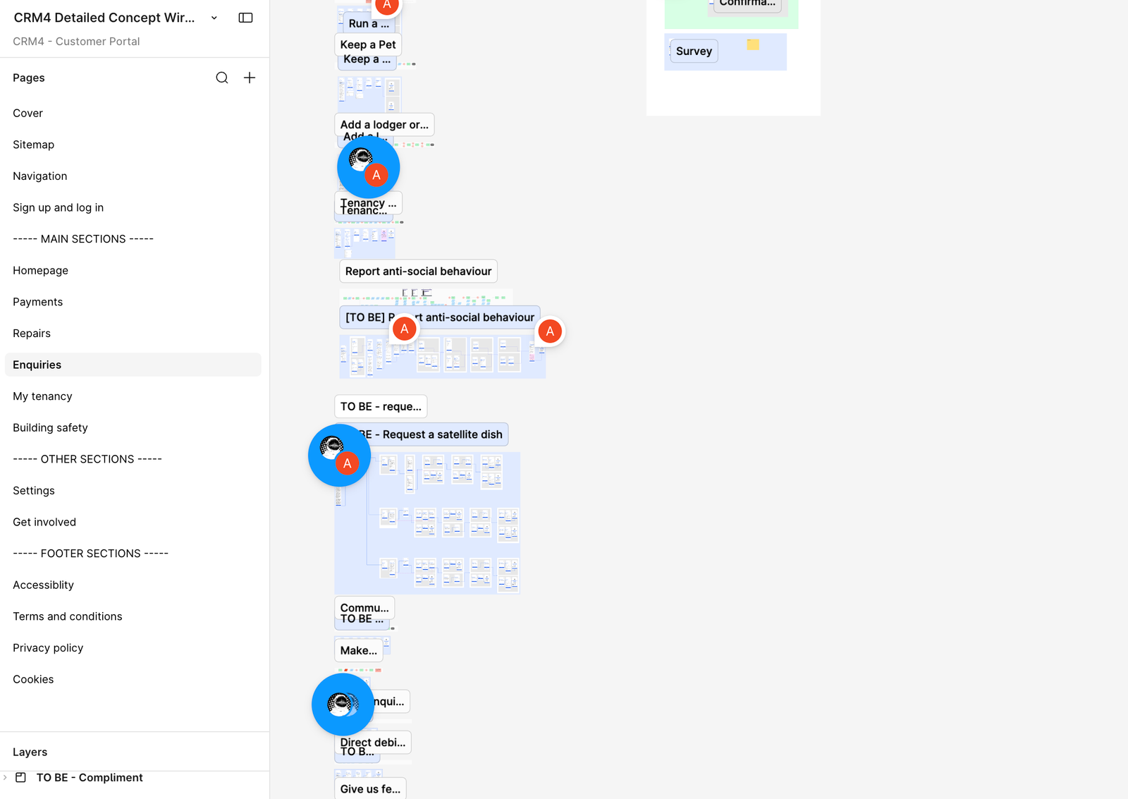
Prototyping
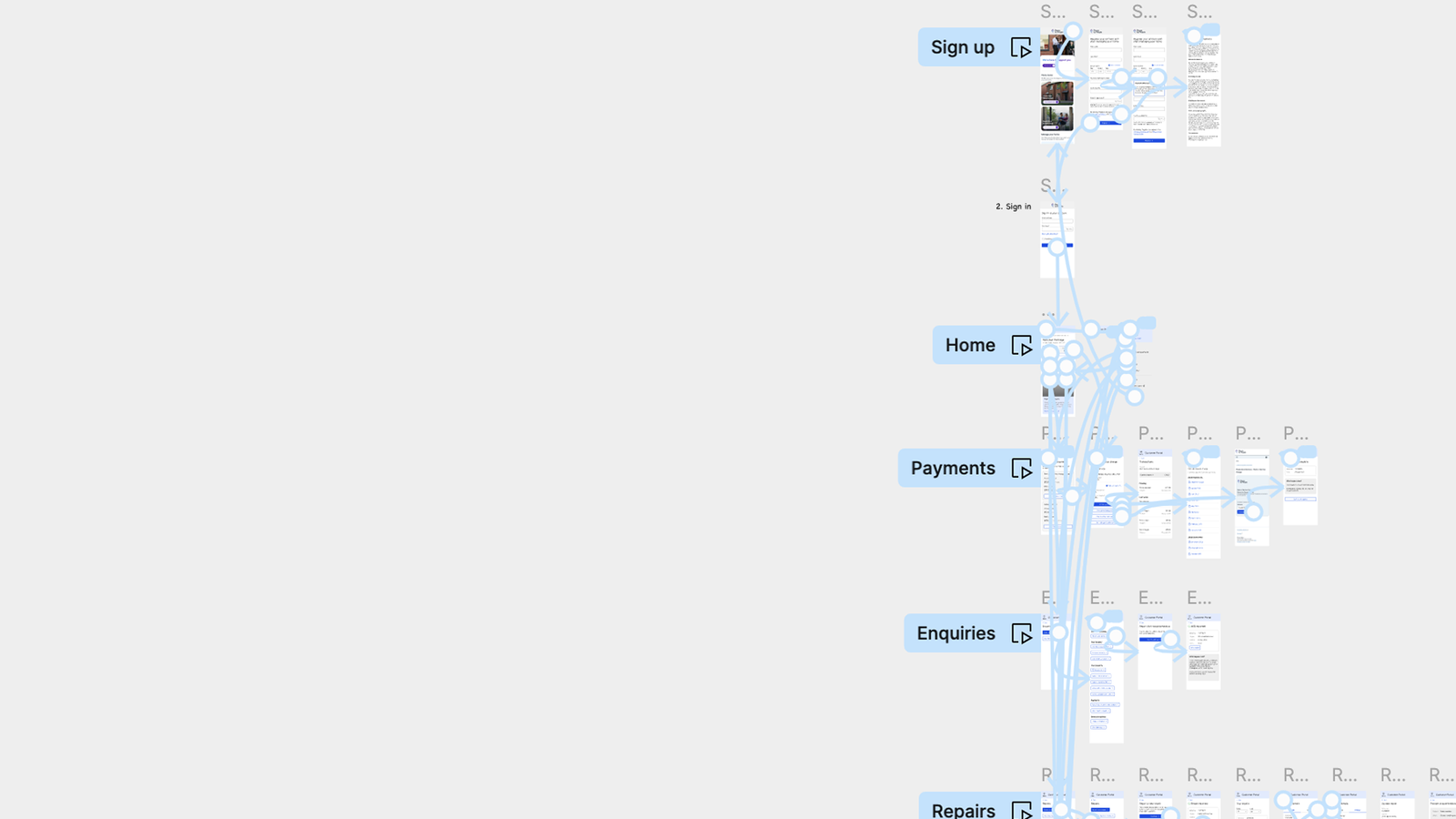
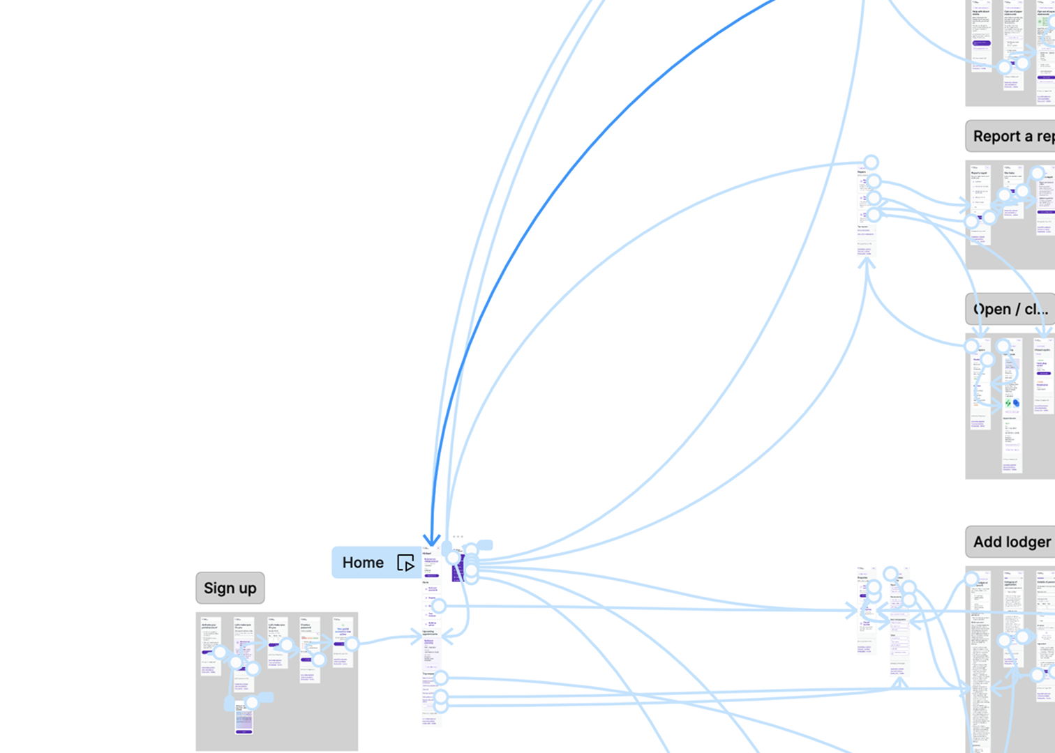
Validating ideas before development
Interactive prototypes were tested with customers before development.
Watching customers complete realistic tasks helped validate assumptions and uncover remaining usability issues before implementation.
Each testing round informed further iterations, ensuring the final experience reflected real customer behaviour rather than internal assumptions.
Rather than asking users if they liked the design, testing focused on whether they could successfully complete meaningful tasks with confidence and minimal effort.
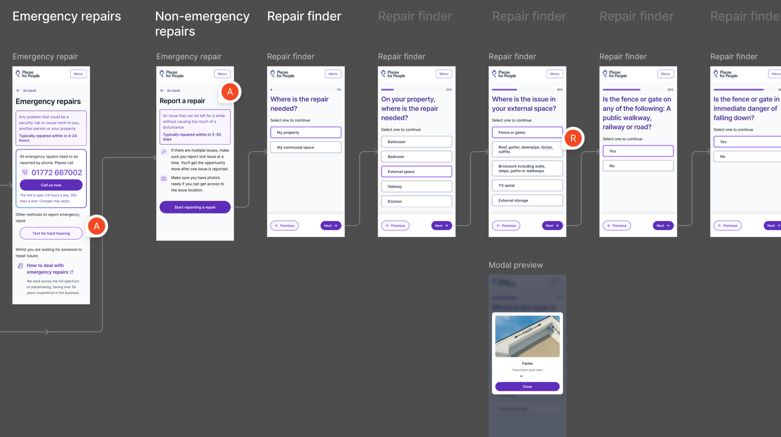
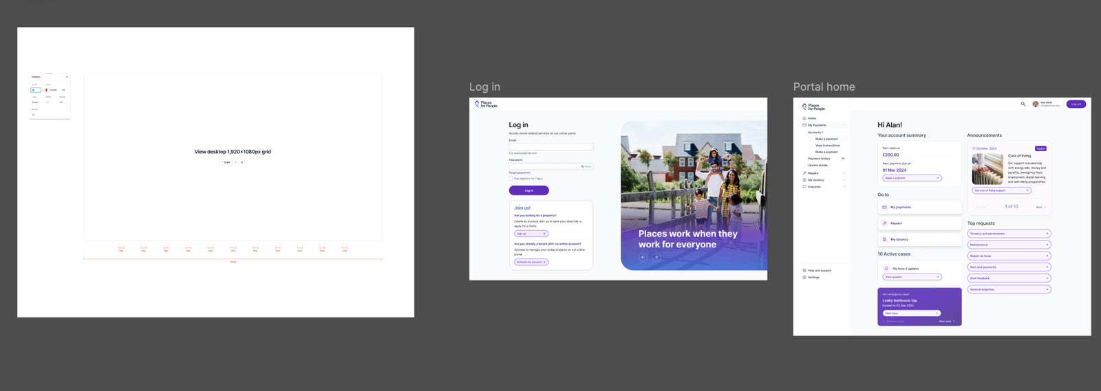
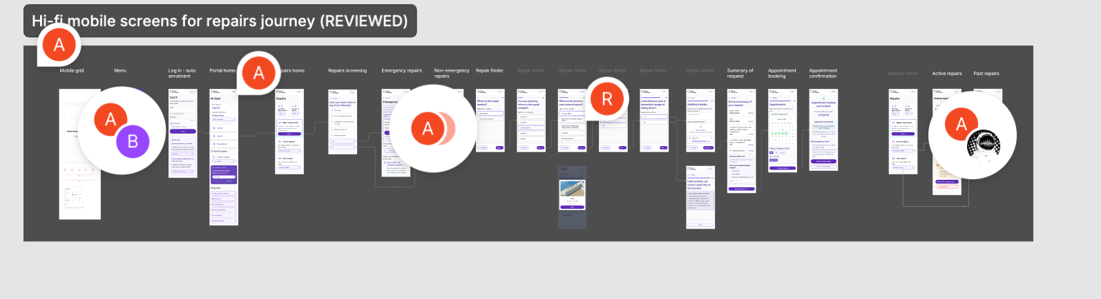
High-Fidelity Proof of Concept
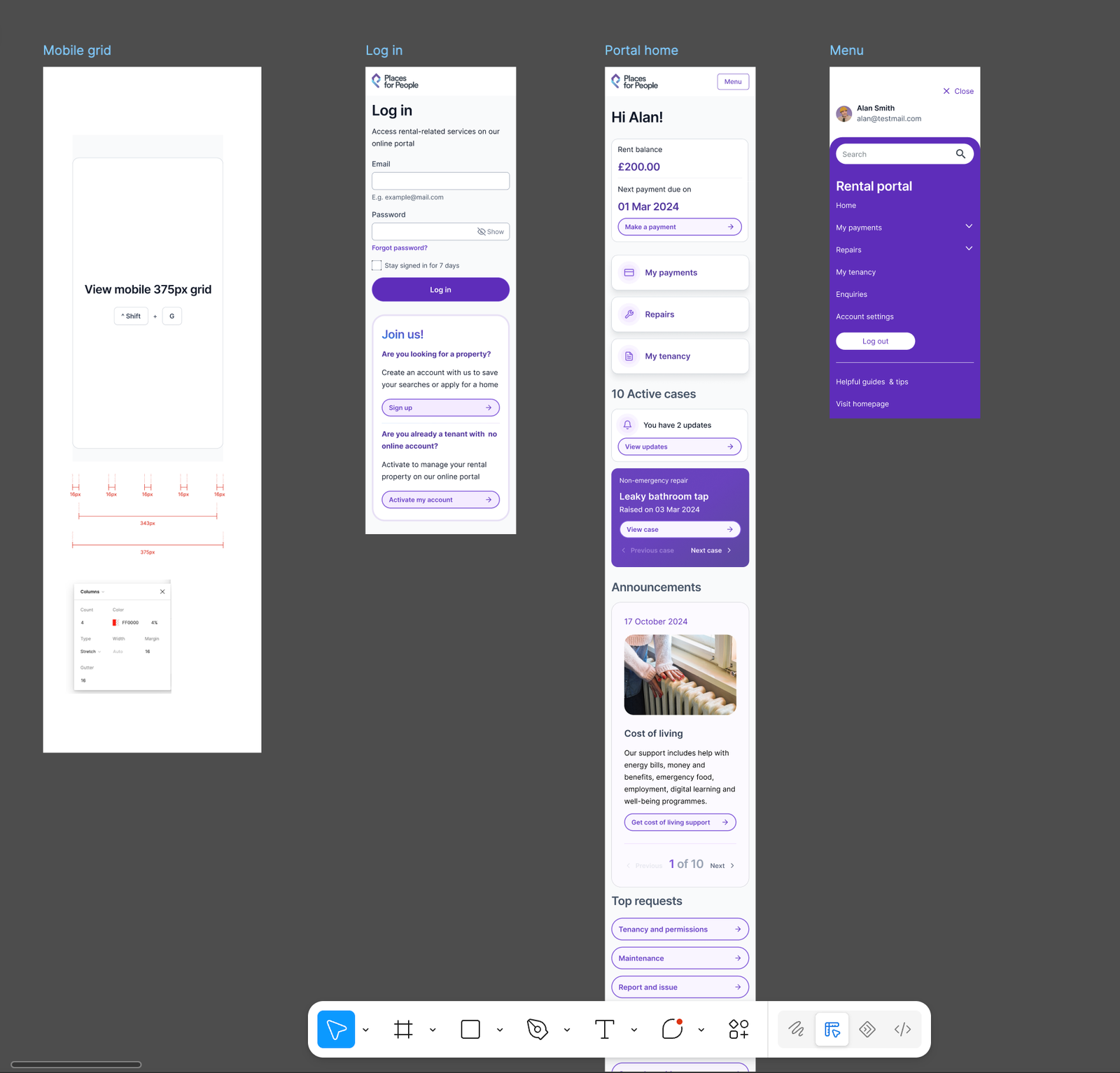
Bringing the experience to life
Once the interaction model had been validated, I created a high-fidelity proof of concept to demonstrate how the redesigned experience would work in practice.
The prototype helped stakeholders visualise the future product, secure alignment across teams and provided developers with a clear understanding of intended behaviours before implementation began.
It also acted as a reference point throughout development.
High-Fidelity Interface Design
Creating a scalable product experience
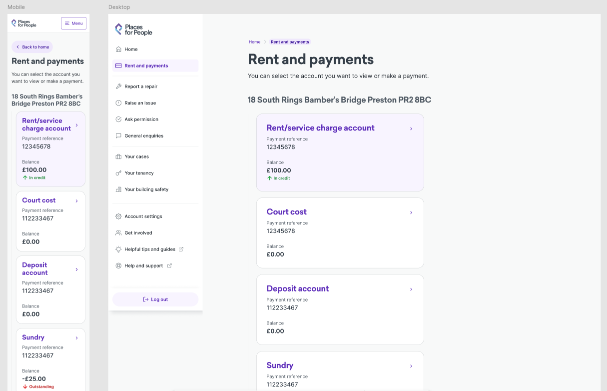
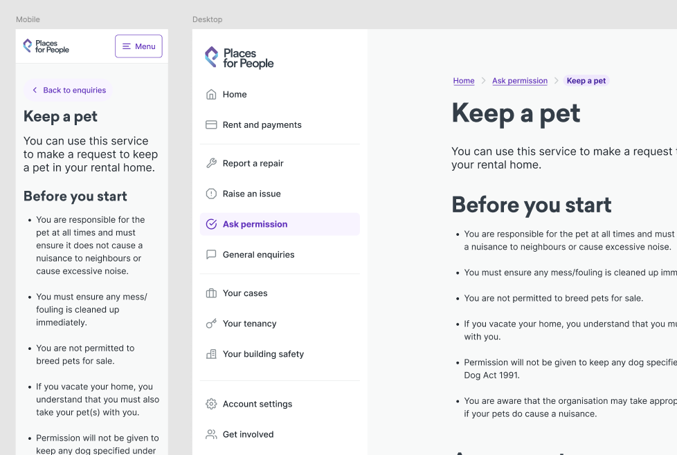
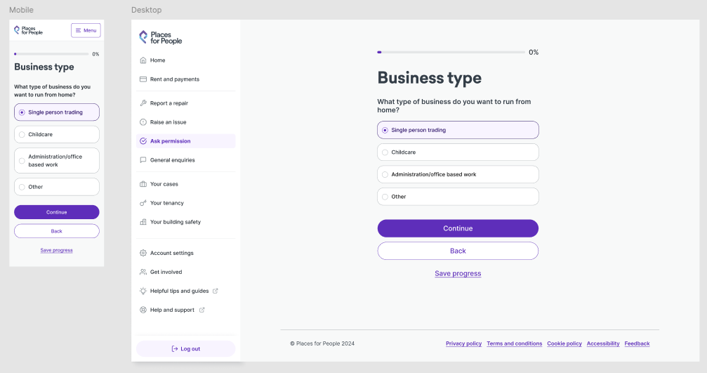
Final interface designs combined validated user journeys with the organisation’s design system to produce production-ready screens across mobile and desktop experiences.
Every screen considered accessibility, responsive behaviour and consistency across the wider platform while remaining aligned to the design principles established earlier in the project.
The final deliverables included detailed specifications, interaction behaviours and reusable components to support efficient implementation.
Mobile Demo
Demonstrating the end-to-end experience
The interactive demonstration showcases the complete customer journey from sign-in through to task completion.
Rather than presenting individual screens in isolation, the walkthrough demonstrates how the redesigned experience supports customers through a seamless end-to-end journey, illustrating improvements in navigation, interaction and overall usability.
Key Design Considerations
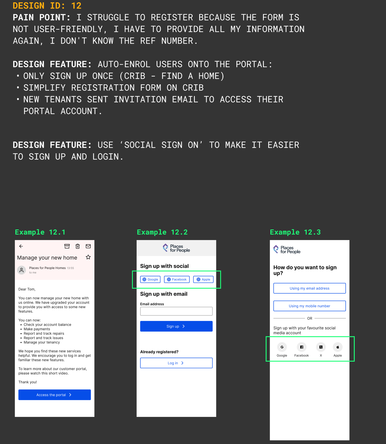
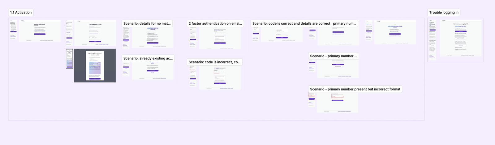
Simplifying Registration
Research showed many customers abandoned registration before creating an account.
The journey was redesigned to reduce friction by simplifying the onboarding experience and making instructions easier to understand.
Making Repairs the Primary Journey
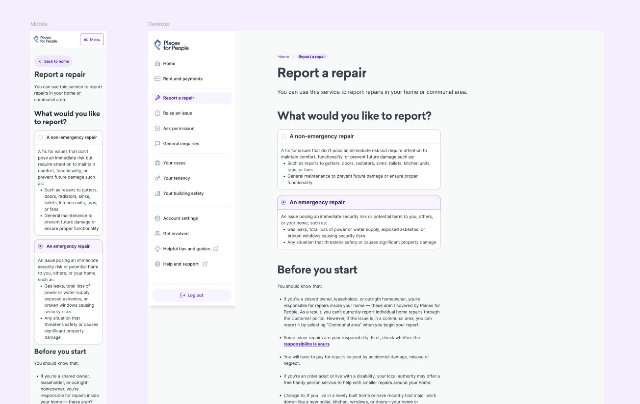
Reporting repairs was one of the portal’s most common tasks.
Rather than burying this feature within navigation, it became a primary action supported by clearer guidance and improved progress tracking.

Mobile First
Around 70% of customers accessed the portal using mobile devices.
Every journey was designed for smaller screens first before scaling to desktop.
Layouts, interactions and navigation were optimised around touch behaviour rather than desktop conventions.
Accessibility
Accessibility was treated as a design principle rather than a compliance exercise.
The portal was designed to support WCAG 2.2 AA standards through:
- accessible forms
- semantic hierarchy
- colour contrast
- keyboard navigation
- readable typography
- plain language
Error Handling
Delivery
Design continued beyond Figma.
Throughout implementation I collaborated closely with developers to ensure the intended experience was delivered accurately.
This included:
- production-ready design files
- interaction specifications
- developer walkthroughs
- sprint support
- design QA
- accessibility reviews
Maintaining close collaboration throughout development reduced ambiguity and ensured consistency between design and implementation.
Suggested Visuals
Developer handover
Design specifications
Figma Dev Mode
QA screenshots


Outcomes
The redesigned portal delivered measurable improvements for both customers and the organisation.
Following the redesign, the new customer portal significantly increased digital adoption, improved engagement, and reduced friction across key customer journeys.
By redesigning the customer portal around user needs, the project increased digital adoption, improved engagement, reduced friction across key journeys, and enabled thousands of customers to successfully self-serve online.
Customer Adoption
Registered users
53,000
↓
165,016
211% increase
Monthly Engagement
16,000
↓
23,202
45% increase
Bounce Rate
43%
↓
25%
42% reduction
Digital Self-Service
Repairs submitted online
14,383
↓
26,458
84% increase
Operational Savings
Each online repair request saved approximately ten minutes of customer support handling time.
Across one year this equated to:
- 120,750 minutes saved
- 2,012 hours saved
- £110,242 estimated annual operational savings
Suggested Visuals
Metric cards
Animated counters
Simple bar charts
Before & After dashboard
Reflection
This project demonstrated that successful UX isn’t simply about creating better interfaces.
Although I joined after discovery, I was able to create significant value by translating research into a clear product direction, aligning stakeholders around customer problems and designing an experience grounded in evidence.
Facilitating collaborative workshops helped create shared ownership across teams, while continuous iteration ensured every design decision remained focused on customer outcomes.
Looking back, I’d involve engineers earlier during ideation to validate technical constraints sooner and accelerate later decision-making.
Skills Demonstrated
UX Strategy
Design Thinking
Workshop Facilitation
Journey Mapping
Information Architecture
Interaction Design
Visual Design
Accessibility
Prototyping
Developer Collaboration
Stakeholder Management
Product Thinking

Leave a Reply