Background
In the project, my primary role centered on crafting designs for the inaugural release of a service website aimed at streamlining the search for domestic abuse support services in Aberdeenshire and Aberdeen City.
This endeavor was undertaken in collaboration with Aberdeen Council of Voluntary Organisations (ACVO), a third-sector interface with a rich legacy of over two decades as a central knowledge repository for the local third sector in Aberdeen City, Scotland.
The project unfolded across four distinct phases: Discover, Define, Develop, and Deliver, with my involvement commencing during the Delivery phase. Three of these phases had already been completed, and we adhered to the double diamond design methodology.
During the Development phase, we had produced three design concepts that underwent validation with users, significantly enriching our grasp of the problem domain.
This case study places particular emphasis on the final phase, Deliver. In this stage, I focused on further refining the most promising concept, known as ‘the dynamic database,’ through additional research and iterations. Subsequently, I transitioned it to our development team for implementation.
Problems to be solved
User research has indicated a desire for a comprehensive database of information around domestic abuse services. Users need to have confidence that it is up-to-date and holds reliable and accurate information about services.
As part of the project, I explored the idea of a dynamic database of support services, that allows users to get access to the right type of information at the right time.
“You’re handed so much info… I think even nine months down the road I still don’t know where to look, who’s the best person in the organisation to ask” – Person with lived experience of domestic abuse (PLEX)
- The research revealed a problem: There was no single place to find information about domestic abuse support services in Aberdeenshire. This made it tough for support workers to guide people in need and for those who needed help (PLEX) to find the right support.
- New support workers didn’t know how to contact these services or what kind of help they offered. The existing solution, a Word document, wasn’t useful or regularly updated on the Aberdeen Protects website. Changes to services weren’t communicated effectively.
- The services weren’t managed well, and updates were infrequent. ACVO needed a user-friendly tool for their staff to manage this central resource easily.
- This solution aimed to meet the needs of both PLEX and those seeking information about domestic abuse, like support workers and practitioners, without overwhelming them emotionally.
The concept
Following an in-depth examination and testing of three concepts during the Develop phase, the ‘dynamic database’ concept emerged as the preferred choice among key stakeholders and users. This concept not only aligned well with the project budget but also boasted fewer limitations compared to the other two concepts.
Furthermore, it was a more direct solution to the core issue identified in user research, which was the need for a centralized database for domestic abuse support services.
The ‘dynamic database’ concept excels in delivering users with dependable support information tailored to their specific requirements. It offers improved accessibility and updatable functionality, effectively addressing challenges that the existing system struggled with.
It is worth highlighting the critical importance of timely updates. Outdated information could have severe consequences for individuals seeking assistance (PLEX), potentially depriving them of the appropriate support precisely when it is most needed.
Goal
The primary goals for this phase were the validation of the user experience and content administration workflow for the ‘dynamic database’ concept.
Target audience
Through the domestic abuse support services database, we want to primarily help two user groups:
- People with lived experience of domestic abuse (PLEX).
- Those who get disclosures of domestic abuse such as support workers, practitioners, friends or anyone a PLEX reach out to.
Process
The process was set out in five 2 weekly sprints

Using Figma for screen designs and prototyping
I used Figma, one of the leading design tools, to create screen designs based on user stories. I began with designing a higher fidelity of the ‘dynamic database’ concept, which served as a visual representation of the digital idea we were developing. Figma helped me refine these wireframes from the previous phase, making them more detailed and resembling the final digital product. and link them to build user flows.
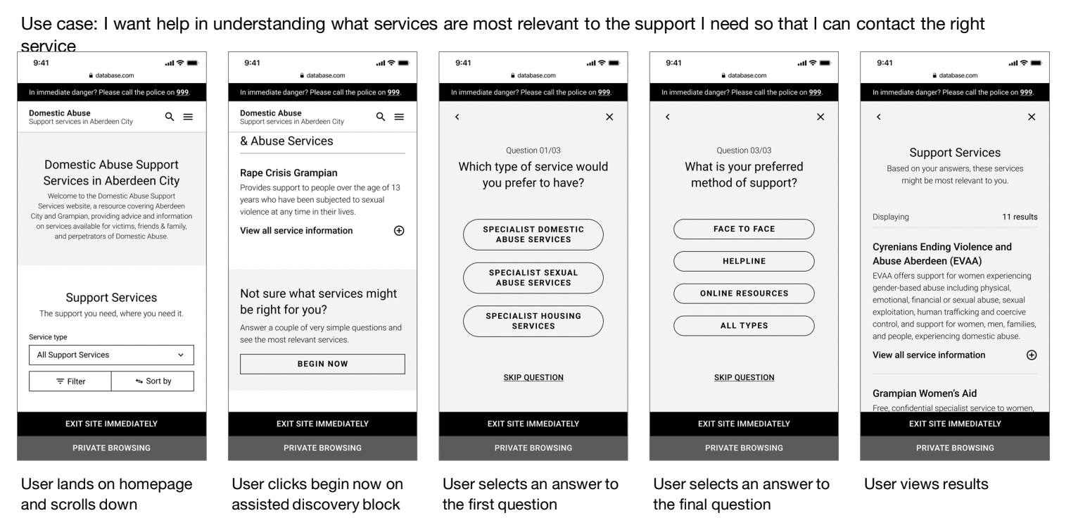
I also created user stories that help define the user journey based on research for example:
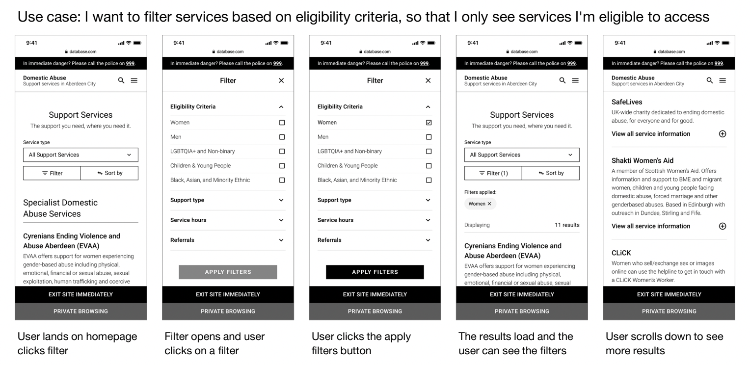
Filtering based on certain criteria
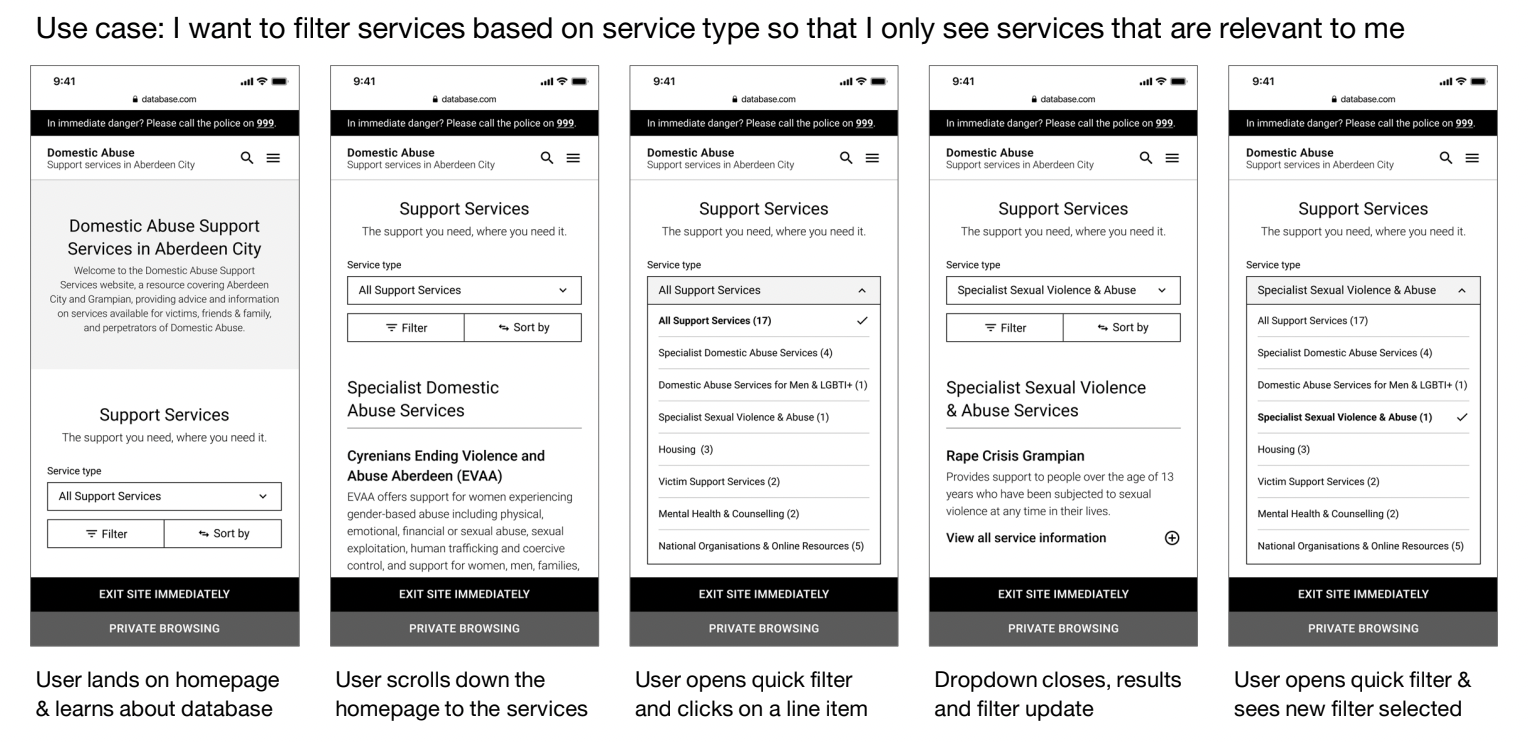
• I want to be able to filter services based on service type so that I can only see services that are relevant to me.
• I want to be able to filter services based on the eligibility criteria so that I can only see services that I’m eligible to
use.
Search
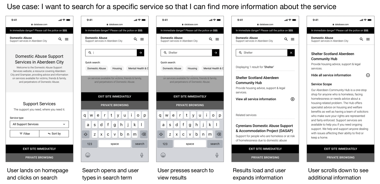
• I want to be able to search for a specific service so that I can find out information regarding that service
Getting service information
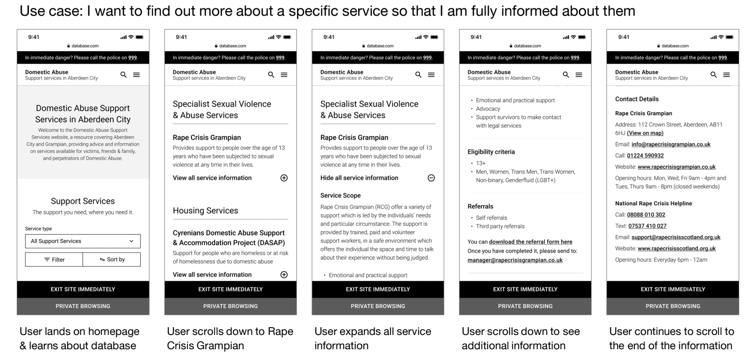
• I want to be able to find out more about a specific service so that I am fully informed about them.
Since our service was intended for Scotland, I used the Digital Scotland Design System. This allowed me to design quickly and ensure the final product would be user-friendly and consistent with other Scottish services. Many of the features imitated interactions found on mobile websites, which was helpful for gathering user feedback during testing.
After designing all the screens, I connected them to enable users to navigate between pages during testing. Following the first prototype iteration, we decided to customize the design system to better match the Aberdeen Protects website where our service would be hosted.
To test the concept, I conducted interviews with users, allowing them to interact with the prototype.
Using WordPress for managing services
Whilst the concept of a dynamic database was validated by user research, the developers were exploring how the concept would work realistically on the web.
The developers worked towards a content management system (CMS). It is software that helps users create, manage, and modify content on a website without the need for technical knowledge. This would solve the problem the client was facing in managing the database to keep it up to date with the most up to date information.
My role involved helping devs with custom post types and getting the right interface ready for enabling the client to populate the database.
Wireframe references and use cases for the development of design
The first Figma prototype
The first prototype that was created focused on the following features:
- Landing page
- Search bar
- Compare services option
- ‘Service type’ dropdown
- Filter functions
- Specialist services short information
- Page sorting
- Specialist services description
- Mobile menu
- Safety exit feature
- Ways to protect yourself online

A screenshot of prototyping on Figma, connecting many components to make the prototype work

Research round 1 – testing prototype with users
We tested version 1 of the prototype with:
- 7 practitioners
- 2 people with lived experience
This round included:
- Mix of practitioners from both council (mainly housing) and other support services.
- All PLEX were women who are in final stages of their process.
We tested mobile layout observing:
- End to end navigation of the site
- Comprehension of language
- Look and feel
Insights from research
Some suggestive insights from research that can help understand user behaviour
- Features and prompts of ‘private browsing’, ‘call the police 999’ emergency contact and ‘Leave site’ were validated by all participants. Although practitioners will most likely not use these three elements are considered of high relevance in relation to the topic in matter, and should be kept for any future versions.
- The option that was used the most throughout the testing was the ‘Service Type’ dropdown; ‘Filters’ and ‘Sort by’ options were mainly used when by users when prompted by researcher.
- Practitioners and PLEX (person with lived experience [of domestic abuse]) have different interests and needs when accessing the website.
- Practitioners will most likely be in a work setting, with more time to search for information and pick up on details of service providers to make an informed decision; contrary to PLEX users whom most likely will not have much time available, might be experiencing emotional distress and whose main interest it to obtain contact details of a service that can support them.
- As both types of users are coming from different places, their experience of navigating through the site and reading the content is different.
- Filters were generally helpful in finding the right services
Some filter item naming such as ‘service category’ was confusing for participants.
Some participants found the number of options were overwhelming particularly for PLEX.
Service status was the least useful
Conducting a card sorting exercise to rearrange content and determine the content’s order.
Participants were asked to order each section of information in order of importance (what are the first things they wanted to see)
The result from this exercise were useful to determine the order of content later in design.
PLEX and practitioners had different viewpoints on what service information is most useful to them. PLEX main interest was ‘Contact information’ versus practitioners that inclined more to eligibility criteria and options for attending. Both coincided with about the service as first item.
Same task was done by participants, were they ordered contact information by importance. Suggested design actions
Re-order service information and contact details information

Examples of specific design decisions as a result of research
Menu
- Change the wording of ‘Service database’ to ‘Services in Aberdeen’
- Reorder the menu
- Re-write the title so it feels more suitable for PLEX as well Leave site
- Change the colour of the button to stand out more Private browsing
- Review of wording, to ensure users identify as a prompt to seek instruction on how to cover tracks, and not interpreted as a feature that by default will cover tracks for them.
- Consider other colour to make prompt stand out.
‘Service type’ filter
- Review wording of dropdown options
- Review options that state specialist services that cater to people from diverse backgrounds. ‘Filter by’
- Re-name the filter titles, review filter options
- Reduce the overall number of filters
- Add instructions or hint to use filter option
- Remove ‘Sort by’
- Bring out the filtering options so that its more visible.
Split the pages to improve experience of user groups
Based in overall observations of interaction with site, and participants expression of different needs (PLEX vs practitioners). Its suggested to include a landing page with one page leading to emergency information for a PLEX and another for the service database aimed primarily at practitioners.

Working with a content designer to improve content
Working collaboratively, we were able to identify problematic wording and better wording as a result of research. Some specific suggestions are listed below

The second Figma prototype
Whats new?
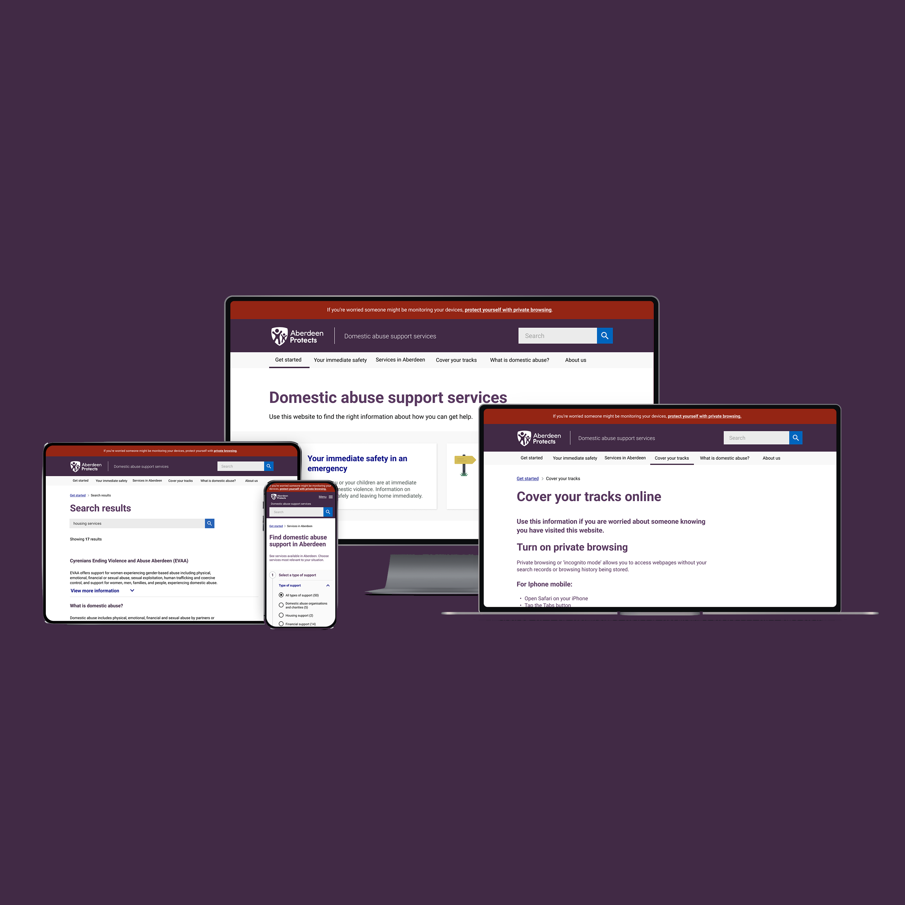
- Clear distinction between ‘services search’ tool and ‘immediate help’ information reflected in both the menu and the landing page
- Improved clarity on how to use the search database through
improvements to the visual presentation of options and through
tweaking the filter options. - Categories within service descriptions are reordered to be as
‘scannable’ as possible for any user to take appropriate action from
their search - Reassurance and encouraging language throughout is key, this is reflected in specific changes to the ‘immediate help’ content
- Safety features such as private browsing and the leave site button are clear, and are seen as important features of this website
Prototype preview
Safety feature
On the coded website, the safety exit button would constantly follow the user around on the bottom right corner.
Phase 2 testing
Participants
We tested version 2 of the prototype with:
• 6 practitioners
• 5 PLEX (People with Lived Experience)
This round included people from
• Different nationalities and ethnic backgrounds
• Mix of professions including accessibility advocate
• Mix of digital confidence levels
• All PLEX were women who are in final stages of their process.
What we did
We tested both mobile and desktop layout observed in testing:
• End to end navigation of the site
• Comprehension of language
• Interaction and flow using features
• Look and feel of site
Phase 2 findings
Some of the finding from phase 2 testing
Interaction and flow
- Overall users were comfortable with using the top bar navigation to seek out information.
Content - PLEX users noted that ‘What is domestic abuse?’ Was not central to the information. If someone was searching for a service, they’d be likely to reaffirm their own beliefs that they really are experiencing abuse. PLEX users could benefit from a flow in menu that guides and provides them information with needed information at the right
stages. - Both practitioners and PLEX highlighted the need for option to translate content of website into different languages
(Polish was language most mentioned)
Get help now page
- Throughout the testing, participants showed general comprehension that the “Get help now’ page is for an emergency and at risk of violence
Specific content learnings
- PLEX participants share that although they might not feel comfortable Call 999, this information together with How to ‘silent call’ is pertinent and useful.
- Disclosure scheme ‘Clare’s Law’, is not considered relevant in this section as it is not an action you would be taking in a moment of crisis or emergency however, participants state that it should be present in other section of website.
- Several observations were made in ‘leave home immediately’ content. First in reference to the term that was interpreted as leaving home ‘for good’ and not as a temporary measure. Secondly, participants expect a listing of additional options where they could stay, prioritizing any local shelter, BnB or local support service.
Services page
- Users were able to understand the function of the page much quicker than in previous testing and were comfortable with moving straight to type of support to find relevant services
Search button
- There was little to no interaction with search button as they expected list of services to pop up instead. It is important to clarify that search button is a accessibility requirement therefore best to consider a change of location or further instructions in any future adaptations.
Type of support and type of service
- Type of support is interpreted as an offer that integrates support in varies aspects of the person’s life (emotional, financial, family, housing, legal, health etc.) These types of support are often interlinked and not necessarily approached separately.
- ‘Type of service’ as a term is considered interchangeable with ‘Type of support’, meaning participants expected same dropdown options.
- In ‘Type of service’ options such as information and advice are considered to mean the same thing for some PLEX users.
General summary
- Website navigation and content should be arranged focusing on PLEX needs, and not necessarily that of practitioners – this still creates a service that works for both audiences
- Accurate and reliable information is vital to both PLEX and practitioner users trusting the website
- Make the service search simple and straightforward to use for PLEX and ensure filters lead to accurate results
- Reassure PLEX at every step of the way to validate their experience.
Encouraging language supports
- Their decision to seek help and could increase the likelihood of contacting services.
- Ensure services are accessible to all, meaning website provides information in different languages, accessibility settings EW implemented, language is inclusive and services listed cater to
different backgrounds. - Filters are useful but could be improved so PLEX users can better identify their needs more quicklyEnsure out-of-hours services can be searched for
Summary of design recommendations
- Reorder the menu options to put information about domestic abuse front and centre. This contributes to the overall reassurance that users are seeking information from the right place, and their actions to seek help are justified.
- Add a ‘tags’ function to displayed results in service search as this will help users differentiate difference services and see which of the filters specifically apply
- Add a new page ‘talk to a professional’ to cater to users who are not in immediate danger, but are not in a place to start searching for their specific needs
- As well as being able to search the database for services that cater to different languages, the database itself must
- Easily translate into other languages to meet the needs of non- native speakers
Next steps
- Figma designs were handed over to developers with documentation
- The site will be published adjacent to the council website for real users to use.
- Once the site goes live, there should be continued iterations to improve the site.



Leave a Reply